
 Today’s post is about colors and, as autumn begins to blow the leaves from the trees, we thought it was the perfect time to talk about the color orange: a transitional shade with plenty of summer in it, but also a touch of autumn. If you’re interested in the psychology of color and its meaning, learning about the different sensations and emotions that colors consciously or unconsciously convey, or you’re simply curious by nature, you’ll also enjoy the posts about the color pink and the color blue. But let’s take it one step at a time—we still have a lot to learn about the color orange and everything we can evoke and convey through it.
Is it one of your favorite colors? Do you like it but still don’t feel comfortable wearing it? Do you like being in spaces where the color orange predominates? Well, today you may discover why.
The color orange: joy, strength, and extroversion.
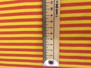 If there’s one thing we can be sure of, it’s that the color orange is cheerful. It’s filled with positive energy that has a lot to do with fun and sociability. For this reason, it’s a color often used in party and event decor, where the goal is precisely to have fun and socialize. It’s psychologically associated with youth, and because it results from mixing red and yellow, it combines and harmonizes characteristics of both.
People who use it frequently or count it among their favorite shades tend to be lively and extroverted, lovers of fun and strong emotions. Its complementary color is blue, which represents and evokes completely opposite sensations: calm, spirituality, reflection… By contrast, the color orange represents impulsiveness and has a frivolous side because it’s so eye-catching.
 If you like it but find it too intimidating, you can tone down its more strident qualities by combining it with other colors. You may not feel comfortable wearing it precisely because it draws attention, since it’s a very visible shade and that’s exactly why it’s used in safety clothing (for work), for example. But it’s possible to soften it by mixing it with other shades, so you can enjoy its warmth and cheerfulness without feeling that you’re giving in to its more frivolous side.
Aside from this detail, practically all the sensations it conveys are positive, which is why it’s one of the favorite colors for decorating interiors. It also conveys warmth because of its strong presence in the sun (just look at a sunrise) and in fire. The color orange is strongly associated with summer, but it’s also very appropriate for autumn.
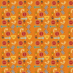 Interestingly, the orange tree is one of the few trees that can have flowers and fruit at the same time, which is why it’s also associated with fertility. When we see the color orange, we receive an impression that conveys strength, passion, energy, triumph… Some of these qualities are present in red and appear in orange in a sweeter, more subdued form because of the mixture with yellow.
It stimulates creativity and, as strange as it may seem, appetite as well. When you’re feeling a little uninspired and need to stimulate your mind, orange is a great ally.
The color orange is ideal for…
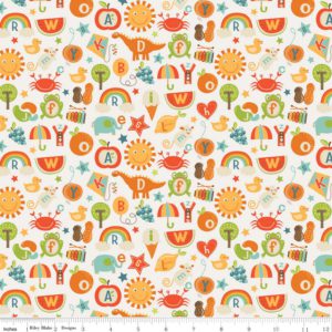 Its ability to stand out makes it ideal for using in accessories, for example. Because of its fun and cheerful connotations, it’s also ideal for children’s clothing. This has even more advantages because, being one of the most visible colors, we’ll always be able to keep track of them and see them clearly. Take advantage of its warm potential to fight the drop in temperatures and coordinate your diy projects with autumn, which will be here in less than a week. This warmth is what makes it an ideal candidate for interiors: cushions, quilts, upholstery…
And since we’re welcoming a new season, let’s do it joyfully. What do you think? Then take a look at our post featuring some fall 2015 trends, and remember that all the fabrics featured in the post are waiting for you in our craft store, with a special discount if you already belong to Lulu Ferris.
Happy fall, and may orange be with you!